My buddy Chris recently blogged about accessing the IoT data from an M&M jar being monitored in one of the breakrooms at SAS. Now I'm going to take things a step further and analyze that data with some graphs. Grab a snack, and follow along, as we dig into this fun (and delicious) data!
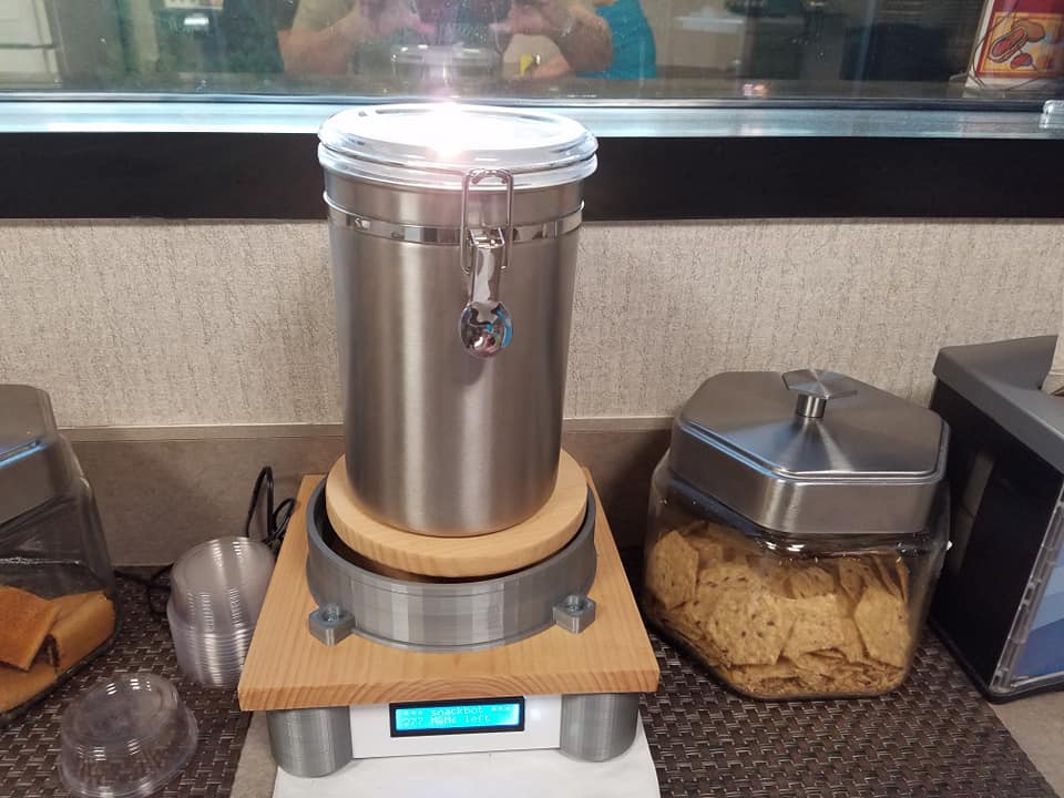
Most everyone familiar with SAS knows that one of the fun benefits of working here is free M&Ms in the breakrooms. And being data geeks, it was inevitable that someone set up a scale under the M&M jars, and made the data available online. Here's a picture of the setup:
Chris showed how to access the data from SAS code, and performed some basic analyses. I had a few other ideas, therefore I set up some graphs of my own to answer several questions about this yummy data ...
How long does the M&M supply last?
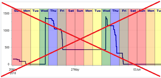
Chris created a timeline graph showing that the M&M jar was re-filled on Wednesday, and the supply was generally depleted within about three days. He used a line to represent the data, and shaded the timeline by the day of week. And in his text he mentioned that the supply for a certain week probably lasted longer because of the Memorial Day holiday. Here's a screen-capture of a portion of his graph:
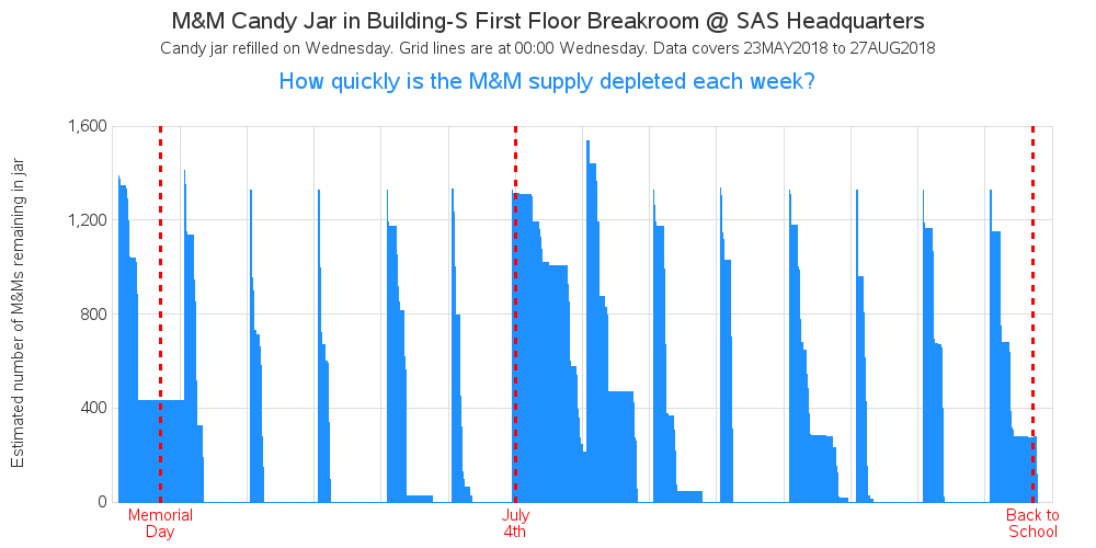
Rather than a line, I decided to represent the quantity of M&Ms by the shaded area below the line. And rather than focusing on the day of the week, I focus on whole weeks. I indicate each Wednesday with a reference line, and the HTML mouse-over text tells the exact range of dates covered by each week. I also add a red label for holidays and other significant dates that might affect the number of people at work, and therefore affect the number of M&Ms eaten.
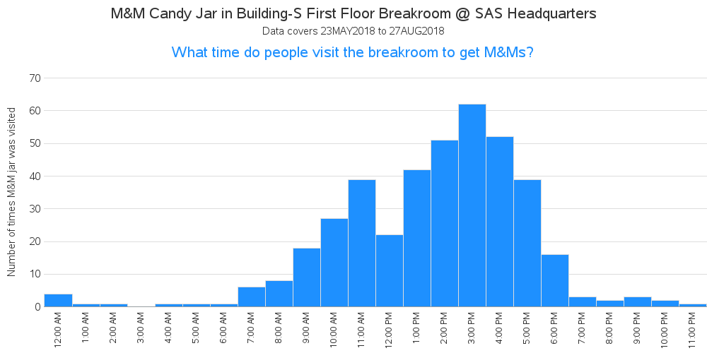
What time do people eat M&Ms?
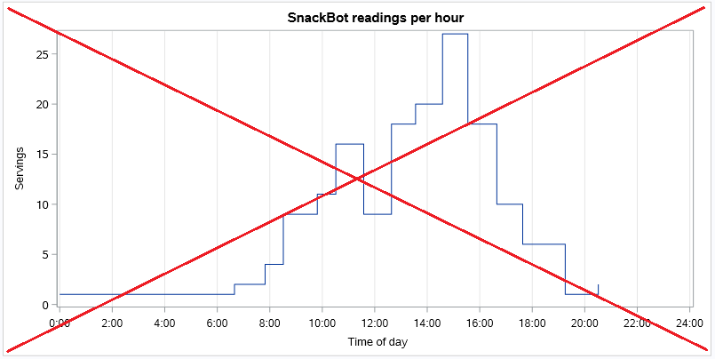
Chris used a line plot with 'step' interpolation to show how many times the candy container was visited each hour.
While Chris' line plot (above) looks a whole lot like a histogram ... I chose to use an actual histogram. With the discrete histogram bars, it is more intuitive that each bar represents 1 hour. And I use am/pm time, rather than military time. Also note that you can more easily see which hours had zero visits to the M&M jar (such as 3am).
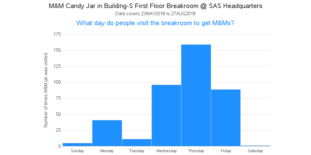
What days do people eat M&Ms?
Chris used a text summary for his day-of-week analysis. But one drawback is that days with no data (such as Tuesday and Saturday) don't show up in the table.
I think it's easier to comprehend data like this in a graph, so I used another histogram (I like using similar graphs for similar analyses, so the user only has to figure out the presentation once). The M&M jar is usually filled on Wednesday afternoon, so there's 1/2 day of eating Wednesday, and a full day of eating Thursday. The supply usually runs out on Friday, and there are occasionally a few left to eat on Monday.
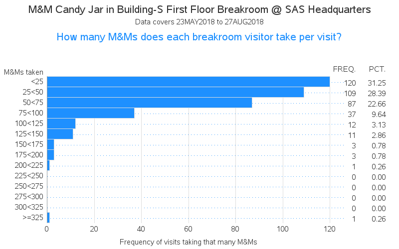
What's the M&M serving size?
Unlike a bubble gum machine, the M&M jar at SAS does not dispense a certain amount of M&Ms - each person uses a spoon to dip out the serving size they want. Some people scoop out just a few, and some people scoop out ... umm, quite a few. ;-) I was curious how the serving sizes varied, so I created another histogram. In order to show the serving size ranges for each bar (along the left), and the frequency & percent of the time that serving size was taken (along the right), I used a horizontal chart - the text labels just fit better with horizontal bars. I wonder if that >325 M&Ms serving was a true oddity/outlier, or a data-collection quirk?
How many people get M&Ms?
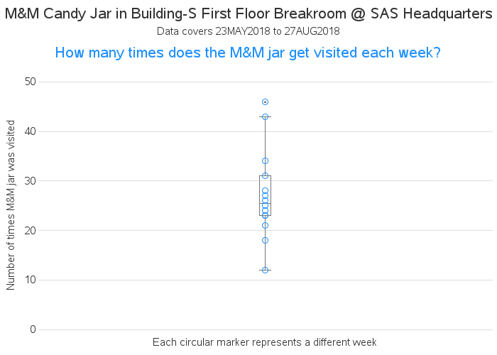
And my final question ... I was wondering how many people eat the M&Ms? The automated scale doesn't record which employee visited, but if I assume that a visitor only comes to the M&M jar once a week (which might be a silly assumption!), then I can count the number of times the M&M jar was visited each week, and assume that was the number of people who got some M&Ms. I summarized the data by week, and created a box plot, and it looks like the median number of visits per week (which I'll assume is also the number of unique visitors) is about 25. I did a quick check in the employee phone list, and it looks like about 50 people have offices on that floor - so about 1/2 the people (or fewer) are getting M&Ms.
What other analyses might we perform on the M&M data? And what other types of data would it be interesting to measure, with a simple weight scale like this? Feel free to discuss in the comments section!

2 Comments
OK - I did a quick query, and uncovered the details...
proc sort data=serving out=serving;
by descending serving_size;
run;
proc print data=serving (obs=1);
run;
It was on Thursday, June 28, at 5:44am. If the readings are correct, the MM count went down from 798 to 451, indicating someone took 347 MMs. I guess the "early bird" really does get the worm -- or, in this case, the MMs! :)
Ooohhhh what further insight! Interesting graphs and follow up questions... I'm curious about the >325 M&Ms serve too - what time of the day/when? Clearly not at 3am ;-)